Insurance Sales Portal
BACKGROUND
Client:
Insurance Provider
Request:
An insurance and investment provider wished to update their existing intranet advisors' portal which users claimed to be cluttered and confusing. The request included a wholesale update to the information architecture as well as modernization of the user experience of the site itself.
Challenges:
The structure of the existing site had become disorganized after years of poor content management and a dated content management system.
Part way through the pre-production phase, we were told that the content of a sister site also had to be included within the update.
The amount of content within the site structure was immense.
Budget:
$2M
PROCESS
I was brought onto the project after initial discovery had already occurred. After a knowledge transfer session, it became clear that the initial approach would include a large information architecture pass followed by extensive user flow diagrams based on user stories defined by the UX team. These would become the basis for proceeding into wireframing the interactive experience. We used an agile process with daily scrums and bi-weekly
Information Architecture
As the UX strategist, I was tasked with investigating the existing information architecture and proposing a new content hierarchy that would be easier and more intuitive to navigate. This study resulted in an extremely robust but much better organized site map which was updated constantly based on internal and client feedback over several months.
Personas
The UX team created a set of personas based on findings from the discovery workshop. Building the personas allowed us to gain a better understanding of the potential users and to begin empathizing with their challenges. I designed and drew the characters and helped to build the content for the presentations.
Storyboards
With the personas defined, we created a set of storyboards, based on a common use case, that tied the different personas together to show how they would interact with each other as well as with the new Advisor Journey portal. These helped illustrate our thought processes to the client and allowed us to gain feedback on whether our interpretation of common workflows were accurate.
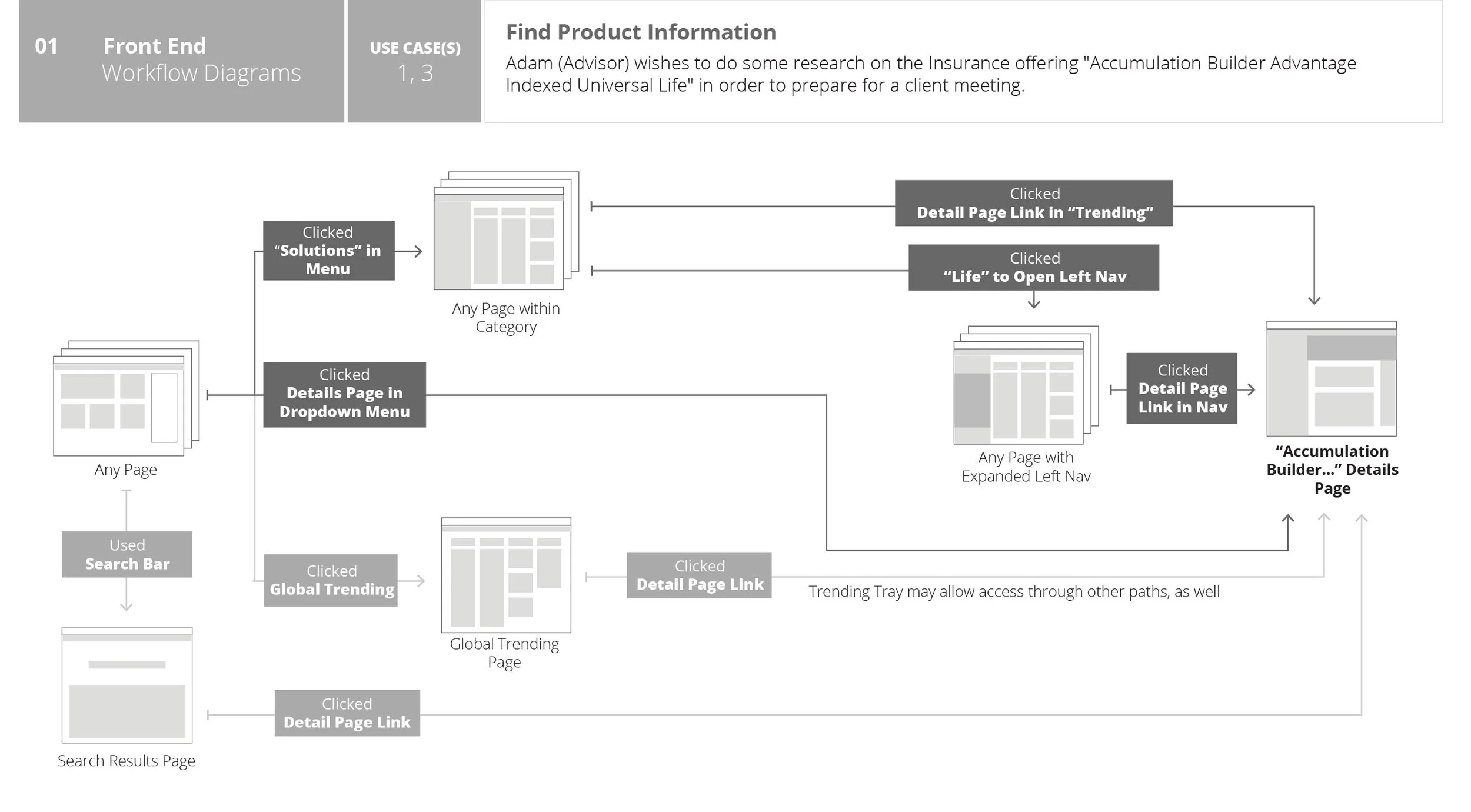
Workflow Diagrams
The storyboards and personas were used to define a set of use cases for various user roles. To define these further, I was tasked with creating detailed workflow diagrams based on role and task. This fleshed out the user stories in more detail than the single-arc storyboard. Though we shared them with the client for feedback, the diagrams were largely used by the internal UX and development teams to help track that the requirements for the portal were being met within the interface design. As with the site map, many iterations and feedback cycles were applied to the workflow diagrams to ensure that our approach would meet the needs of the end users.
Wireframes to Design
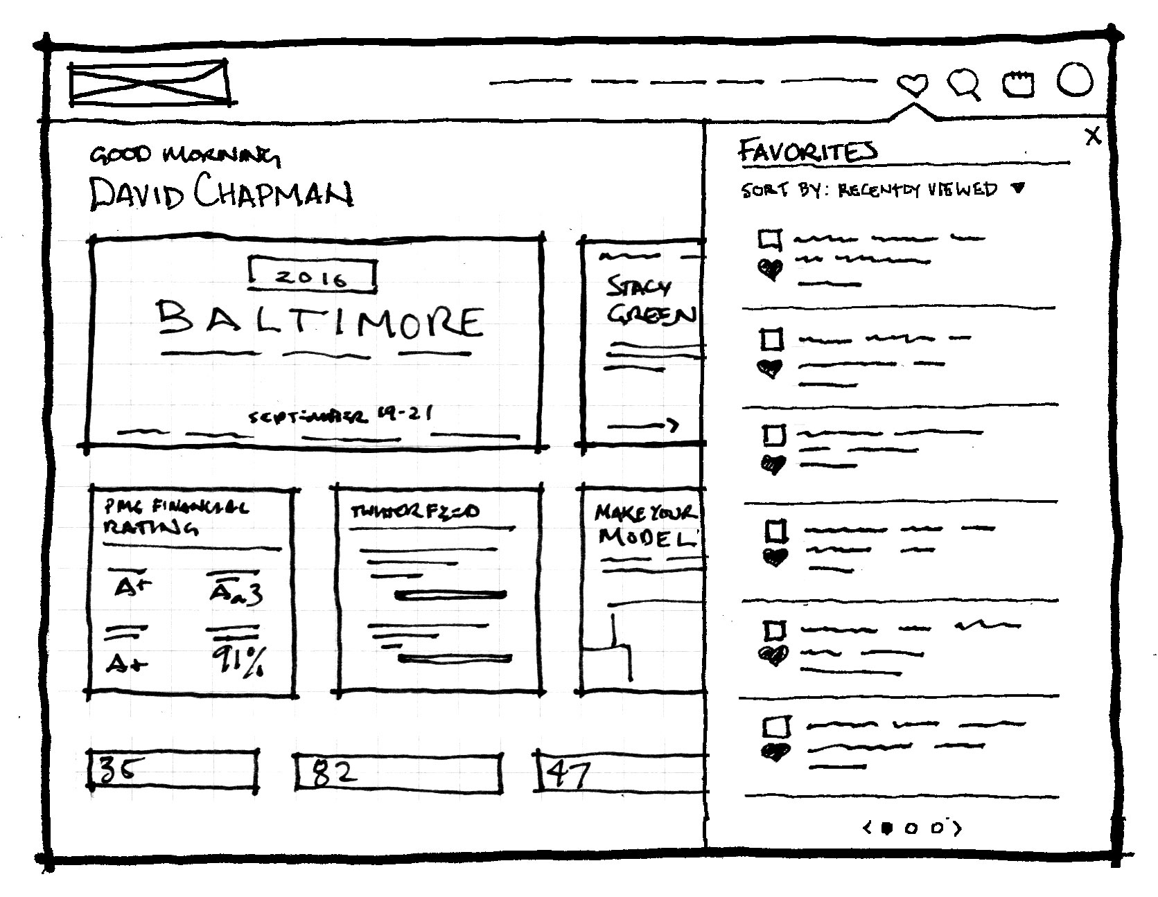
Once the user stories and workflows were defined, I was tasked to begin iterations on wireframes. Multiple sketch versions were iterated and reviewed, leading finally to more hard-lined versions created with Sketch. These also met with multiple internal and external review cycles in order to continue refinement of usability and requirements accuracy. They were then handed off to the UI design team to flesh out mockups with actual assets and content.
PROCESS
Though I moved on to new employment before completion of the project, the client stakeholders had expressed their satisfaction with the amount of thought, planning, and collaboration that had taken place during production. Through the rapid iterations of pre-production design materials that have been shared with the client, they felt a distinct sense of ownership in the updating such a large scale site map because of the constant request from input at key stages of the process. Additionally, we had taken into account the structure of the site as content shrinks and grows, investing considerable time in ensuring a site structure that was logical, extensible, and easy to understand for content managers in the future.
My Role: UX Strategist
Design Team: Magdalena Kabelis (UI), Dave Magdales (UI), Sasha Chaplin (UX) Bradley Hale (UI), Phil Retay (UI)
Project Leads: Adrienne Zarn (PO), Shane McWhorter (UX Director), Andrew Pignato (Design Director), Jaremy DeBoer (Scrum Master), Don Guzdziol (Scrum Master)
Client: Levatas, Inc. - Contract
Responsibilities:
User Experience Strategy and Consultation
Storyboard Illustration
Information Architecture
Personas
Wireframe designs
Workflow diagrams


